We briefly touched on technical analysis in my previous article ‘The Four Stages of a Stock’, and in this article I want to introduce some simple technical analysis components, which, if understood, can provide a lot of clarity on price action in the market.
Candlesticks are said to have been invented by a Japanese rice trader, Munehisa Homma, who devised a pattern to trade rice. In the early eighteenth century, a futures market emerged in rice – coupons were used for batches of rice promised for delivery at a future point in time, and a secondary market of coupon trading began to flourish.
Steve Nison brought the notions of candlesticks in his book Japanese Candlestick Charting Techniques to the Western world, and since then they have become the bread and butter of any trader’s chart.
Candlesticks
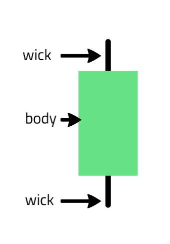
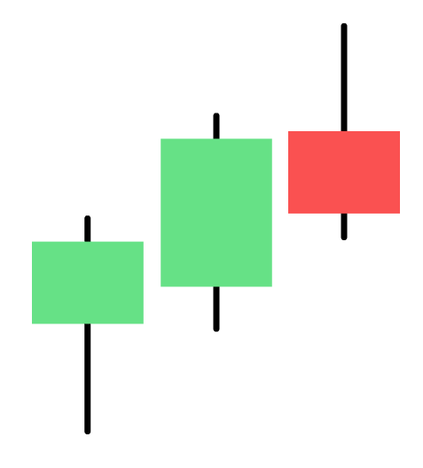
Candlesticks, or candles, are a very basic way of summarising the price action for that specific period. For example, a daily candle plots the open and the close price (the body), and the wicks show both the highs and the lows of the day that were paid. The colour of the candle denotes whether the price closed positively (often green) or negatively (often red) from the open.
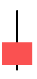
Below is a simple green candle where the bottom of the body would be the opening price, and the top of the body would be the closing price. This would be the opposite way around in a red candle, showing that the price closed down with the closing price at the bottom of the body. With SharePad and ShareScope you can change the colour to a colour of your choice.
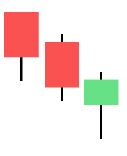
As well as indicating both the low and the high of the day, the wicks also tell us more about the day’s price action. For example, a candle with a long downwards stick signifies that sellers took the price down only for buyers to reject the move and bid the price back up. This is a hammer candle.
Candles are commonly used in the daily period, but can be used in any period – some examples are the 1 minute, 5 minute, and 15 minute periods. 1 hour and 4 hours are also used. We need to pick the period that suits us best. It is no use using 1 minute candles if we are only executing our trading and investing decisions at the end of every day. Likewise, a day trader who is scalping across periods of minutes is not going to find much worth in viewing only 1 hour candles.
Hammer candlestick
Here is a what a typical hammer candle will look like.

Hammers can occur anywhere in charts but they are often used in an attempt to predict the end of a downtrend, as seen in this example.
Hammers do not need to close higher than their open, but they do need to have long and extended downward wicks that show the buying appetite. If you see a hammer candle after a long downtrend – especially if it’s on higher than average volume – take notice. It could be that a change in trend may be underway.
Here are two examples of hammers which changed the trend both times in Future (LSE: FUTR).

Both hammers say the price dip below the 100 EMA and bounce back up, and then went onto to continue the trend. Moving averages are helpful in this way because different stocks react to different moving averages, but in this instance, it is clear the 100 EMA acted as support. If the price trends down to the 100 EMA I know where my buy order will be – just below the 100 EMA where the price has rebounded from the past two times. Is this guaranteed to work? No – of course not. But as traders all we can do is keep taking good risk/reward trades and hope for the best.
Shooting star candle
The shooting star candle is the opposite of the hammer – it also has a long wick but this is pointing upwards (it is also known as an ‘inverted hammer’). The long wick above the body of the candle shows that buyers pushed the price up before selling pressure came into the market to take the price back down again.
Shooting stars are at their most bearish after an extended bull run and suggests that the selling pressure is beginning to overwhelm the buyers.
Ideally, we want to see these candles after an uptrend, like this:
Here is an example of a huge shooting star candle. This was when Motif Bio’s (LSE: MTFB) drug iclaprim passed its second part of its Phase III trial, REVIVE-2. We can see that the price opened at around 45p, rushed all the way up and printed a high of 52p, only for the stock to then close below its opening price!

The key indicator here was the volume. We saw monster volume, several hundred percent of the average volume, which meant that sell appetite on this particular day was huge. That’s not what we want to be seeing in stocks where we are holding long positions in, unless there is sufficient buying power to overwhelm the sellers. In this case, it wasn’t. Unfortunately, many shareholders here held on and the stock gradually trended down to fill the gap, and eventually hit 30p a few months later. The shooting star on huge volume was the clue to sell.
Another example of a chart which has both a shooting star and a hammer reversal is EVR Holdings (LSE: EVRH). We can see the shooting star on large volume appear on July 8th – the day the Wireless Festival ended – only for the stock to trend lower and then put in a huge hammer on big volume a few weeks ago.

On both occasions, the volume marked each trading day as significant. With the hammer, there was clear buying appetite and the stock moved up in the next few trading sessions. Could it be the start of a new trend? Nobody knows – but we can be sure there were plenty of buyers as the stock went below 4p. This is a great trading stock long and short, and significant candles present nice trading opportunities.
A final example is AIM stock market darling FeverTree.

Within a few weeks of the shooting star candle appearing, it had almost halved in price. Now, this wasn’t a direct result of the hammer, but the shooting star itself, on large volume, was a clue that things were changing. The entry signal for the short was when the stock broke through its 50 EMA support, and the stock offered another short opportunity when it broke through its 200 EMA for the first time. You can read more about candlesticks in my free book – ‘How To Make Six Figures in Stocks’
Volume
The areas of the chart that contains increasing volume is by far the most important. Price moves on little volume are insignificant, but price moves on large volumes show key areas on a chart. Candles that appear on heavy volume are more effective than those that appear on less volume. Volume picking up can show the trend starting to change as buying interest steps in, or as sellers rush to offload.
Here is a recent example of a stock that has seen increased buying, which, in turn, has driven the price higher.
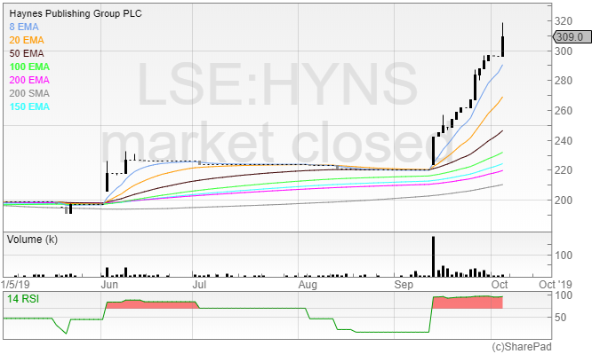
You may know Haynes as the boring books your Dad had on his cars, but there is nothing boring about the stock.
The company’s results on September 12th appear to have put a rocket under the share price, with volume being way higher than the average volume consistently. If we’re buying breakouts from a trading range, this is exactly what we want to see. The price moving out of the trading range, and also being supported by more buyers of the stock driving the price higher.
Volume increases in a trend can signify either a bottom or a top forming. If volume is increasing after the price has been falling for a protracted period of time, then it means there is more interest coming into the stock in the form of buyers. This can be a clue to start looking for a base to form, or a breakout of a recent price high. When volume increases at the top of a move, it can be a sign of indecision. Holders who have been long are now looking to exit, and this can cause volatility in the price. Usually, when we see volume and volatility increase, it can be a warning sign that the trend is about to reverse.
Conclusion
There are various indicators out there, but these are the two that I would absolutely not go without. One danger of candlesticks is that we place too much emphasis on each individual candle – therefore it makes sense to use them in combination with volume. When volume cranks up, look at what candle is being printed on the chart.
There’s a saying in trading: amateurs open the market, and pros close it. It’s the closing price that matters; the closing price depends what form the candle will take. The closing price is also more significant because those who have a position have enough conviction to hold it and take the overnight risk.
When we see prices close at the top of their daily range or close on an intra-day high, there’s a strong chance of a follow through the next morning. Look out for this next time you look at a chart – if you look at what the price is telling you, this will help with trading decisions. Why would you go long on a stock the next morning if it was closing at the low of the day on big volume in the session prior? You wouldn’t – but people do.
Here’s an example of Ted Baker, which issued a profit warning on the 3rd of October.
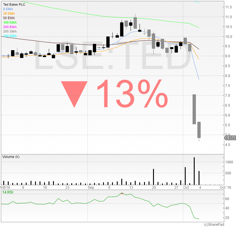 We can see that the price closed at the low of the day on huge volume, telling us that the price was likely to continue its trajectory downwards.
Punters love to gamble on catching falling knives, with no strategy or risk management in place. But if you actually want to make money in trading, then a quick check of the chart and the candles should prevent such rookie errors.
Michael Taylor
For more guidance on adding candlesticks and volume to your charts take a look at the Sharepad and ShareScope tutorials or contact the support team.
No stocks mentioned in this article are recommendations to buy. The author does not hold a position in any of the stocks mentioned, long or short. You can read interviews from traders and investors, book summaries, and articles on the stock market on Michael’s website at www.shiftingshares.com.
This article is for educational purposes only. It is not a recommendation to buy or sell shares or other investments. Do your own research before buying or selling any investment or seek professional financial advice.