A SharePad customer, Chris, reminded me of the power of ranking recently, when he emailed to say (among other things):
“I find that I am playing with spreadsheets to get the data in place rather than actually making decisions. I guess sometimes too much data can be detrimental…”
Decisions are hard, and messing around with data is fun, but there is no shame in getting the data in place. By working out what data we need and how we want to use it we are defining what kind of investor we are. But, as Chris implies, herding the data should get us closer to the end-point – a decision.
Why we should worship the data
In an ancient blog post, one which made me laugh out loud when I first read it and still makes me smile today, blogger Wexboy advocated worshipping the spreadsheet.
His basic ruse was to create a virtual safe space in which we can focus on what matters, and distract ourselves from the daily movement of share prices and the misleading emotions they provoke. My own spreadsheets focus instead on fundamentals. They rank companies, literally guiding me to which shares to buy and sell. Although my rankings incorporate subjective judgements about a business as well as financial data, today I will stick to ranking financial information, which SharePad has in abundance.
In SharePad, ranking a table of shares by a single criterion is simply a matter of double-clicking on a column heading. We can also create tables to show how a share compares to the market or its sector for a wide range of individual financial statistics (see this tutorial). But rankings really come into their own when we combine them, because combinations allow for the fact that in evaluating shares we make trade-offs between one criterion and another.
I often use SharePad filters to isolate a group of shares that loosely meet my requirements, and rank them to decide which to investigate first. To do this we must rank the shares by each individual criterion we are interested in, combine the rankings, and re-rank the shares by the combined ranking. The easiest way to combine rankings is to add them together.
Let’s go in search of cheap shares with strong balance sheets using the assets to equity and PE ratios.
Assets to equity
The ratio of assets to equity measures balance sheet strength. Low values are good. The strongest balance sheet has an assets to equity ratio of 1, which means all the company’s assets are financed by equity. If the assets to equity ratio is 2, then total assets are worth twice the equity in the business. Remember the balance sheet equation:
assets = liabilities + equity
When assets are only half financed by equity, the other half must be financed by liabilities for the balance sheet to balance. Liabilities are obligations that must be repaid, typically debt and payables (money owed to suppliers or customers for example). Since companies are under no obligation to repay equity, it is a safer form of finance. The greater the proportion of equity finance the stronger the balance sheet.
Intangibles to Assets
Liabilities are not the only thing to worry about when considering the strength of balance sheets though. If the value of the asset side of the balance sheet is suspect we can also get a false impression of a company’s financial strength as liabilities may form a greater proportion of the ‘true’ value of a company’s assets. I put true in inverted commas because the value of certain categories of asset are particularly subjective. Chief among these is intangible assets, so the second criteria we will use in our ranking algorithm is the ratio of intangible assets to total assets. This ratio will always evaluate to less than one, since intangible assets cannot be worth more on the balance sheet than total assets. A high value, close to one, is bad, because it means most of the assets are intangible.
PE ratio
The PE ratio probably needs no introduction. It compares the share price to earnings, which is the most recent year of profit after tax. Since earnings belong to shareholders, the PE is a yardstick of the notional return on an investment in the company at the current share price. If a company’s share price is ten times its earnings (a PE of 10), investors might expect a 10% annual return (or earnings yield) on their investment each year. To complicate things though, earnings fluctuate, and people’s expectations of future earnings embodied in the price fluctuate even more, so the PE ratio is only a crude guide to whether a share is cheap.
Cheap shares with strong balance sheets
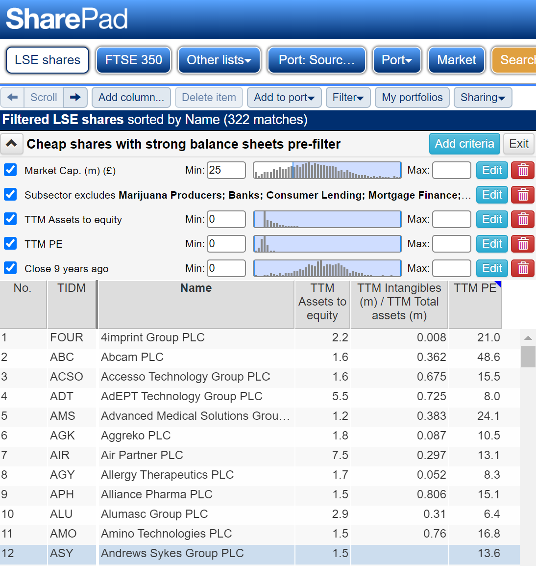
To start with we can filter out certain shares we are unlikely to be interested in. These settings are personal, but I exclude very small companies (judging by their market capitalisations), shares in certain industries that do not interest me, and shares with short track records as listed companies.
Also, we need to exclude companies with negative assets to equity, companies whose liabilities are worth more than their assets (and whose equity is therefore negative). These have weak balance sheets but the ratio evaluates to a negative number and this mucks up the ranking. We also need to knock out companies with negative PE ratios for similar reasons. A negative PE ratio means a company had negative earnings, it lost money over the last twelve months.
Note also the last share in the screenshot below, Andrews Sykes, has no entry for the ratio of intangibles to total assets. This is because it has no intangible assets, which is a good thing.
To filter data in SharePad follow these instructions.
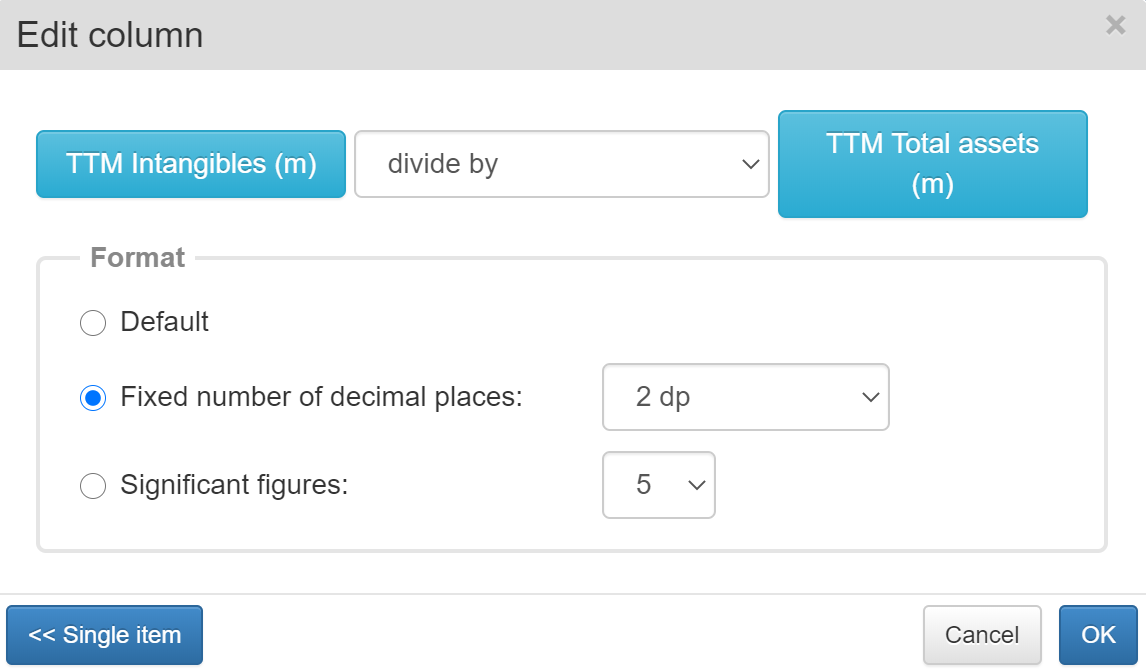
Next we tidy up the table columns, deleting some created by the filter that we do not need for ranking and adding a column for the ratio of intangibles to total assets, which is not in the filter. The ratio of intangibles to total assets is a combination of two statistics in Sharepad, intangibles and total assets:
To learn how to add a column to a table and combine it with another statistic, follow this tutorial
A good place to hunt for bargains
Over 300 shares meet the filter criteria, which is a lot to comb through. We need to prioritise – which is where ranking comes in. We now export the table from SharePad using the Sharing tab, add columns to rank each of the three criteria, add the ranks together, and then sort by the combined ranking to show the shares with the strongest balance sheets and lowest PEs at the top.
It all happens in a spreadsheet like the one below, the imported data is on the left, the ranking of the individual criteria in the middle, and the calculation of the combined ranking on the right. In the outermost blue column we rank the combined rankings and sort the whole spreadsheet so number one is at the top:
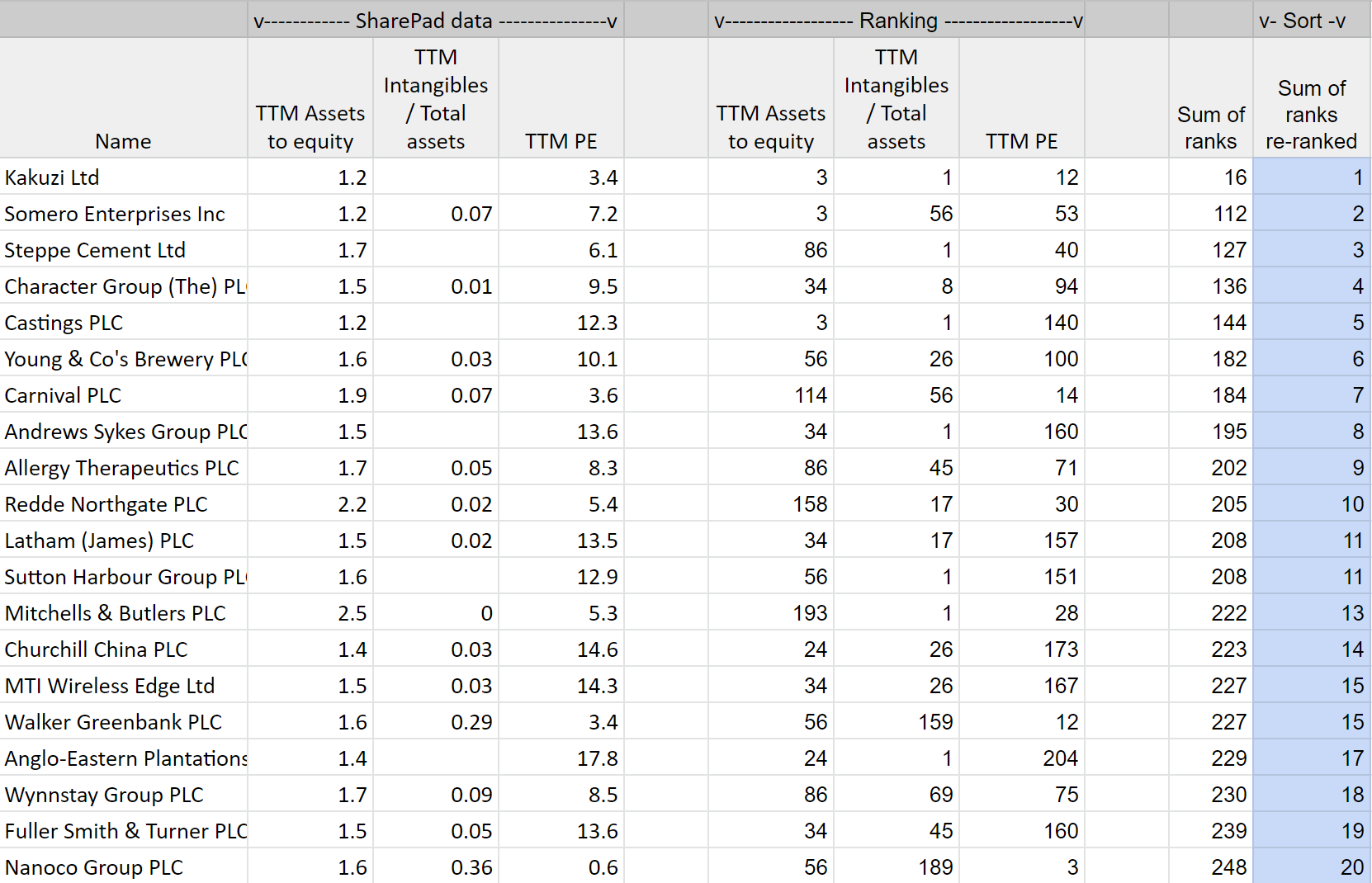
The spreadsheet uses the RANK formula, which is explained here. You can view my spreadsheet in Google Sheets and make a copy to edit or download a version for Microsoft Excel here.
This spreadsheet may be a good place to hunt for bargains. The results are a curious mix. They include exotic shares in capricious markets like Kakuzi a Kenyan tea grower and Somero which sells specialised equipment for levelling concrete. Also present, are companies in industries that have all but shut down during the pandemic and face uncertain futures while social distancing is still recommended, companies like cruise line Carnival, a couple of pub chains, and Churchill China, a manufacturer of tableware for the hospitality industry – the restaurants we are no longer eating in.
Judging by their PE ratios, investors think the prospects of these companies are bleak but some of them have been highly profitable in better times and their strong balance sheets may give them the resources to survive and prosper. Somero, Castings, a manufacturer of lorry parts and possessor of one of the finest balance sheets known to the LSE, Churchill China, and timber merchant James Latham come to mind.
Postscript: Ranking in SharePad
- Perhaps the most famous ranking system was invented by Joel Greenblatt, a hedge fund manager, who popularised it in a best-seller: The Little Book That Beats the Market. It combines return on capital and the earnings yield to identify good firms at cheap prices.
- Phil Oakley experimented with versions of the Magic Formula that may improve on it. He also combined Cashflow Return on Capital Invested (CROCI) and Free Cashflow Yield.
- A close approximation of Greenblatt’s Magic Formula, as well as Phil’s alternatives can be found in SharePad’s filter library.
- I have used ranking to simulate the Fundsmith strategy.
- Happy ranking!
Richard Beddard
Contact Richard Beddard by email: richard@beddard.net or on Twitter: @RichardBeddard
This article is for educational purposes only. It is not a recommendation to buy or sell shares or other investments. Do your own research before buying or selling any investment or seek professional financial advice.