In this article I’ll be looking at trend reversals with a focus on price action. I’ll break down the meaningful timeframes that add weight to primary trend reversals and also zoom in a little to highlight secondary trend reversals.
Price Action Reversals
Listed below are the three types of price action trend reversals in order of how common they are. I say three as the bearish patterns are just the reverse of the bullish patterns.
Bullish Reversals:
- Active Low – Higher Low – Higher High. Nearly all trend reversals will have this pattern.
- Active Low – Double Bottom – Higher High. Less common as many don’t complete and break down.
- V Bottom – Rare as this pattern usually mutates into one of the previous patterns.
Bearish Reversals:
- Active High – Lower High – Lower Low. Nearly all trend reversals will have this pattern.
- Active High – Double Top – Lower Low. Less common as many don’t complete and breakout.
- V Top – Rare as this pattern usually mutates into one of the previous patterns.
At this point many people will be calling out “head and shoulders” or “cup and handle” and all the other names that have been pinned to reversals. These three price action patterns above will cover all reversals no matter what you choose to call them. The beauty of price action is knowing that you are predicting a reversal if you don’t actually have a confirmed reversal already posted. If a stock is recovering you will get a reversal.
Meaningful Timeframes
I want the reversal to be meaningful to the timeframe I’m interested in, so for a primary trend I want a reversal to be visible on a weekly chart as a minimum. For a secondary trend, it should be visible on a daily chart. As I’ve covered in previous articles, I also want to trade in the direction of the primary trend, so a quick look at the weekly price action to see where I am is good practice before looking for a daily reversal level.
Let’s look at some visual examples of each…
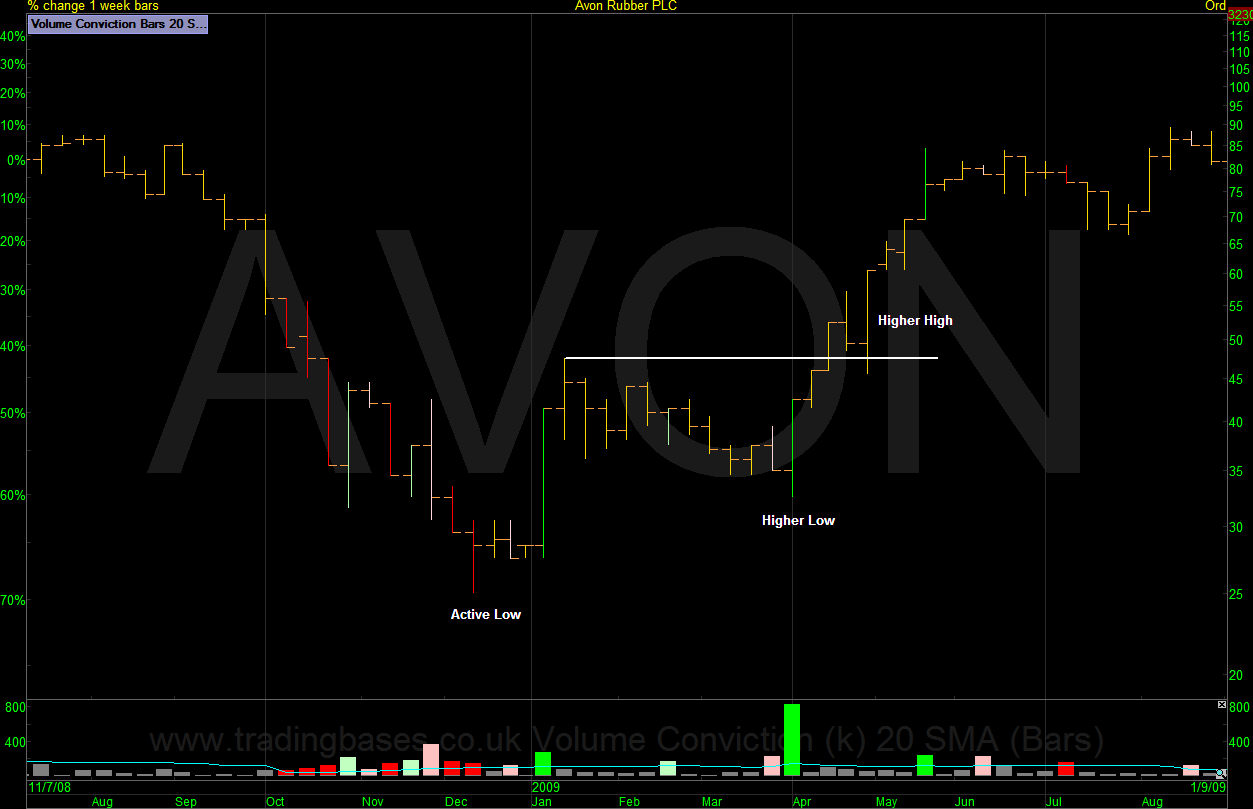
Active Low – Higher Low – Higher High (Avon Rubber)
Reminder: Bullish Reversal / Nearly all trend reversals will have this pattern.
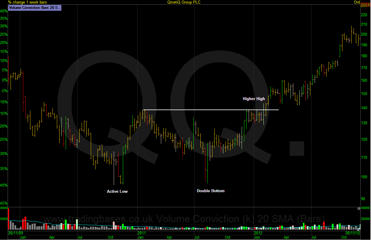
Active Low – Double Bottom – Higher High (QinetiQ Group)
Reminder: Bullish Reversal / Less common as many don’t complete and break down.
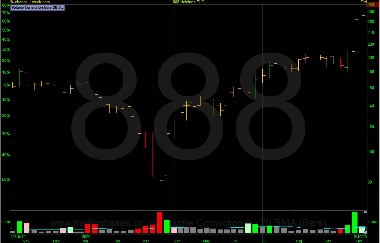
V Bottom (888 Holdings)
Reminder: Bullish Reversal / Rare as this pattern usually mutates into one of the previous patterns.
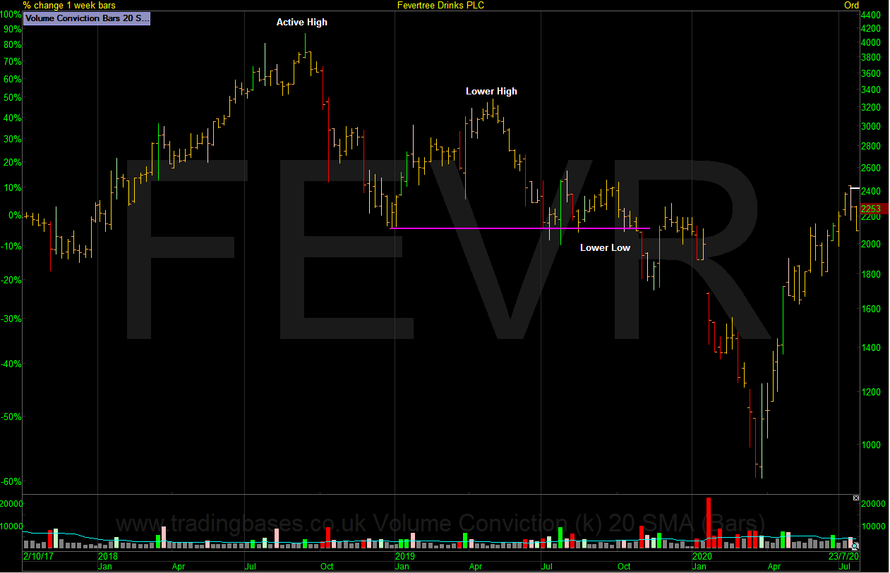
Active High – Lower High – Lower Low (Fevertree)
Reminder: Bearish Reversals / Nearly all trend reversals will have this pattern.
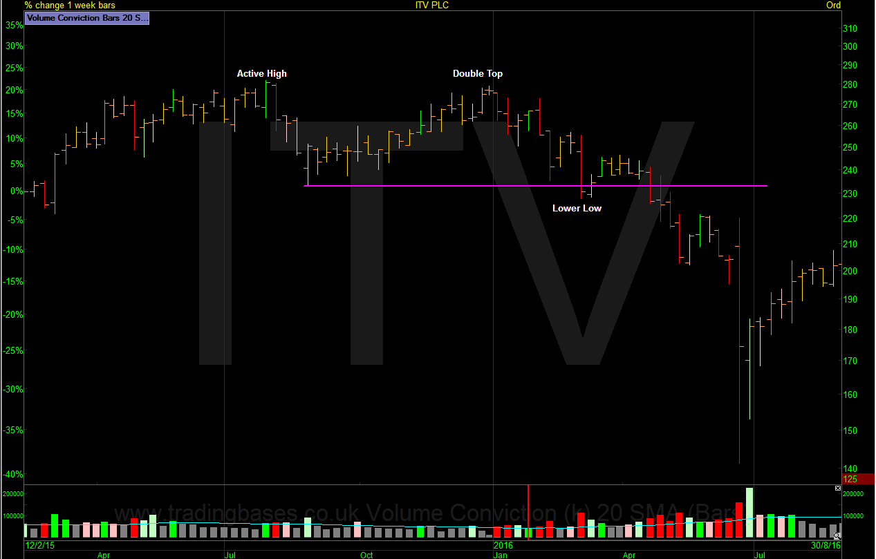
Active High – Double Top – Lower Low (ITV)
Reminder: Bearish Reversals / Less common as many don’t complete and breakout.
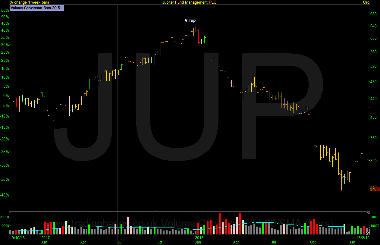
V Top (Jupitor Fund Management)
Reminder: Bearish Reversals / Rare as this pattern usually mutates into one of the previous patterns.
Building a Case
Let us now revisit some of the previous articles to layer the levels of confirmation in our favour.
Is the dynamic moving average trend filter for my timeframe rising over an acceptable time frame? Is the higher high of the price action reversal a meaningful level for the timeframe I’m focusing on? 52-week highs would be very meaningful for most. It may be a little late for some but this is personal to our own timeframes. A trend follower would be happy with more confirmation as the price action tends to get more orderly which in turn results in a better weighting in the stock when it comes to position sizing. A contrarian investor might want less conformation and focus in on a secondary price action reversal within the primary pattern thus cheating the confirmation but accepting more volatility and dealing with that with a lower weighting in the stock.
The Switch
Wherever you do business, the ability to look at the price action and define where the meaningful line in the sand is “the switch” that turns “sell the rip” (rally) into “buy the dip” (pullback) will be extremely helpful for psychological, money management and execution reasons. Once I have a confirmed primary trend reversal, there is the option to move down to the secondary trend time frame and look for the same patterns of confirmation on the daily chart. If you trade illiquid small cap stocks then forget it as these will look too choppy on a zoomed in daily chart; the bigger picture levels will be more useful and more meaningful.
So, next let’s work through an example of defining “the switch” with the silver mining company, Fresnillo.
The Switch – Primary Trend Reversals (Fresnillo)
- The higher high is confirmation for the rising trend
- The lower low is confirmation for the falling trend
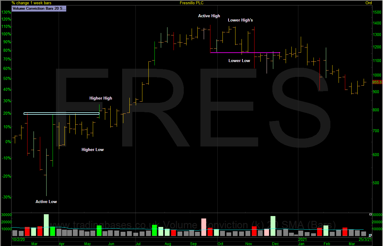
There will be whipsaws. Nothing works all the time obviously so building a case will give greater edge. Build a technical case and for my own style of finding the best growth stocks I ask if the stock has a reason to trend higher into the distance. We have thousands of stocks to look at so bringing the pool of stocks down to a manageable amount is crucial. Others might choose value or even filter by sector or index. The choice is endless. I choose growth.
The Switch – Secondary Trend Price Action Reversal (Fresnillo)
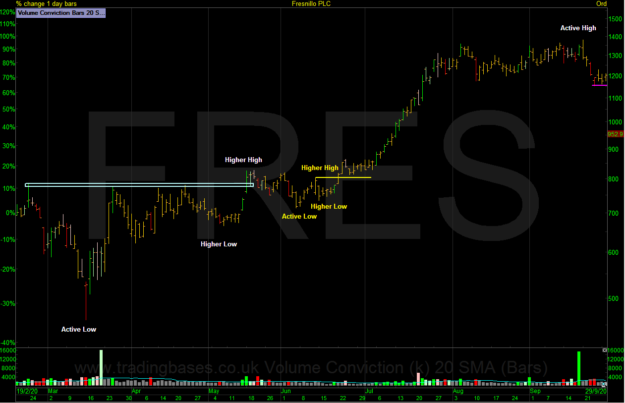
Using multiple time frame analysis we can zoom in from the weekly to the daily chart and see the same patterns that happen in every reversal playing out over and over again. The chart above has the same Active Low / Higher Low / Higher High combination that is now visible on a daily chart. Trading in the direction of the primary trend from a low-risk execution zone is where I find maximum reward to risk.
The Switch – Secondary Trend Price Action Zone of Interest (Fresnillo)
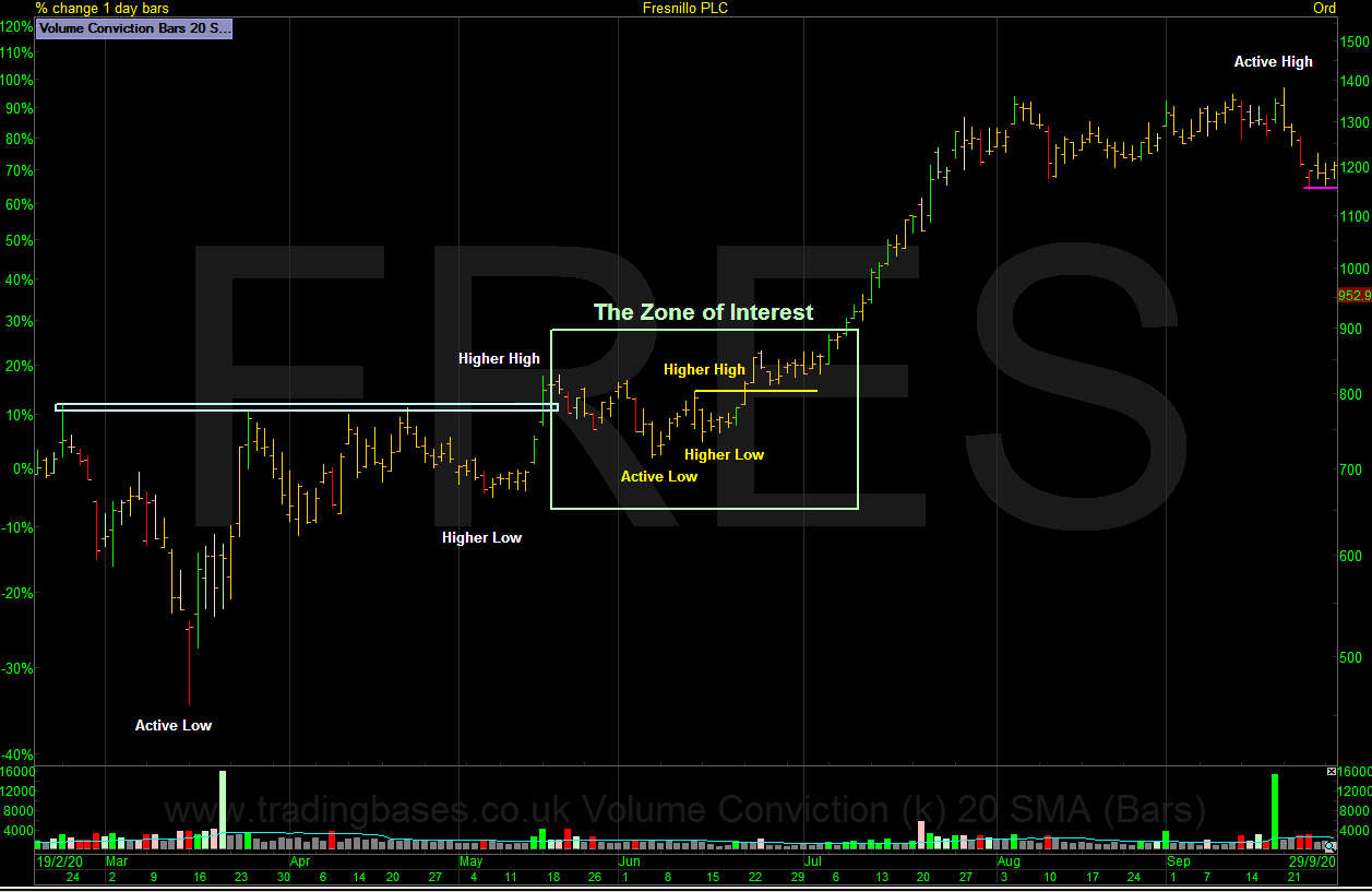
The zone of interest is where maximum reward to risk is found. Note that the smooth trend follows this zone so if you already see the trend you might be chasing prices. Maximum reward is found on the signal. Not in the rear-view mirror. The zone of interest on Fresnillo has all the usual setups people use, be it primary or secondary trend breakouts and secondary trend pullbacks. But note that you don’t always get the chance to buy an early pullback.
Short Trade Price Action
If you take the time to study price action after a bearish primary trend price action reversal you will notice that stocks trade very differently on the short side. They tend to be very choppy and volatile and for that reason many will avoid the short side as it’s extremely difficult to get meaningful positions loaded with the increased volatility.
Final Note
Trading around primary trend reversals in beaten up stocks involves turning over a lot of stones to find good candidates. The price action around these lows is generally wide and with loose volatile swings; being later in the move where I can size for a more meaningful weighting can and usually does return far better risk-adjusted returns. For instance, a 50% gain on a 5% weighting at a higher price where the chart is more orderly will make you more than a 100% gain on a 2% weighting in the volatile bottoming price action. There’s also the time factor to consider as stocks can be trading sideways for years and never breakout to trend higher. The faster you find out when you’re wrong the faster you move onto the next position and the faster you can compound the account. My goal as a trend follower of growth stocks is to get the account invested in stocks that are trending now and this is where I find the best recovery candidates as they emerge.
Jason Needham
@stealthsurf
This article is for educational purposes only. It is not a recommendation to buy or sell shares or other investments. Do your own research before buying or selling any investment or seek professional financial advice.