In response to a reader’s request for a sell filter, Richard goes looking for trouble in his portfolio by setting some “curiosity triggers”….
One of the better bits of advice passed between investors is to sell shares when the reasons you bought them no longer hold true. Most of us will have all sorts of reasons for buying shares, but if you are a SharePad user it is likely some of those reasons will relate to the financials. We use financial ratios to help us identify shares to buy, so perhaps we can use them to monitor, and ultimately if we lose faith in the shares, sell.
One way to do this is to create a new table in SharePad using the Settings menu at the bottom of the screen. I have called mine “Warning signs” and applied it to model portfolio I run for Money Observer magazine:
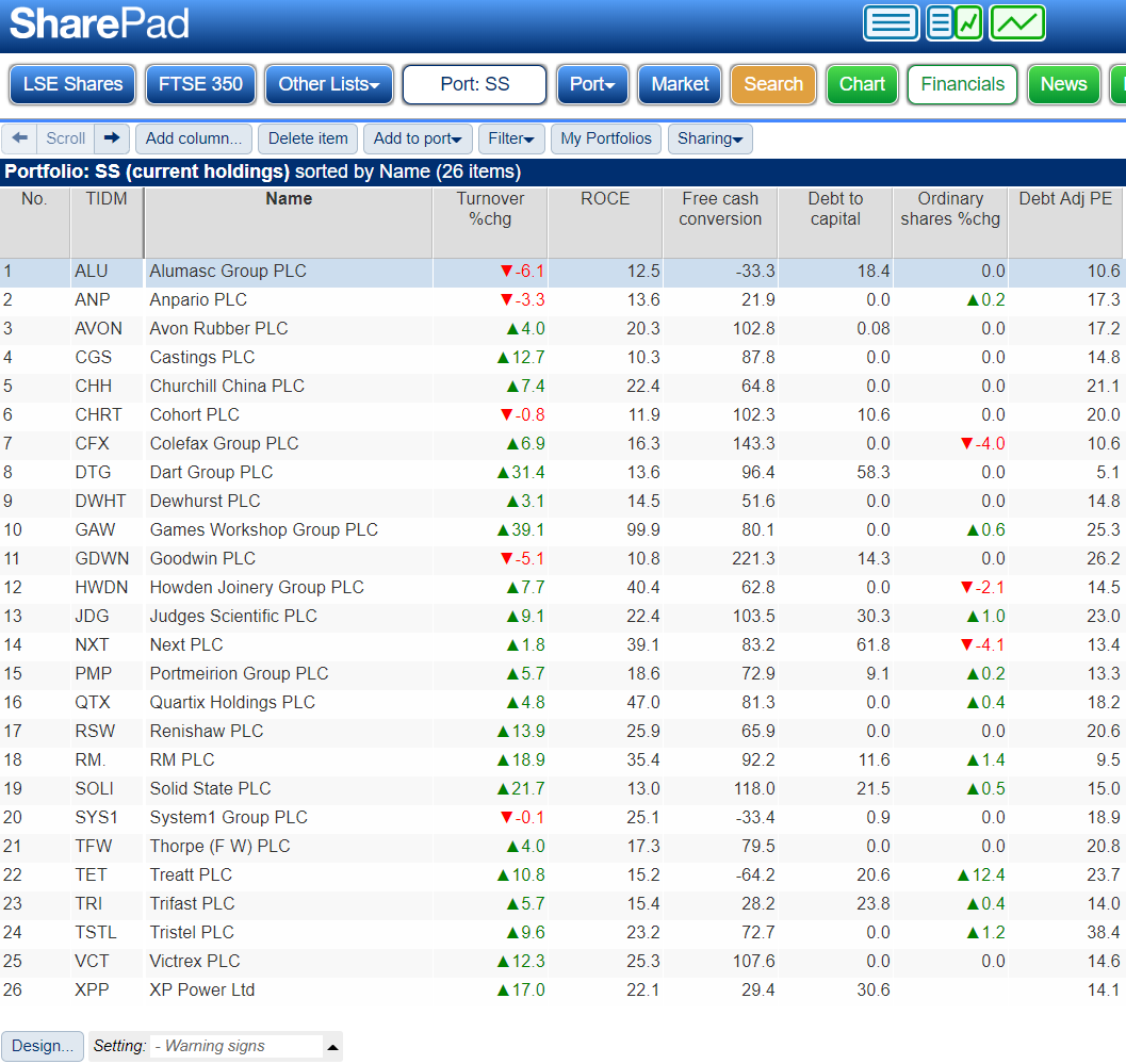
We can populate this table with columns containing the financial statistics we think are most important. I chose the criteria in the “Warning signs” table because I prefer to invest in companies that should prosper through thick and thin, they should earn a decent Return on Capital Employed. I also prefer it if a firm can finance growth without having to borrow or raise money from shareholders by issuing more shares.
Curiosity triggers
To monitor these variables we need to think about the minimum level of performance we expect from the companies we own in a particular year: What is the minimum return? How much debt would be too much? What is the lowest acceptable level of growth?
These are my red lines (and just like other politician’s red lines, they’re sometimes negotiable. Let’s call them reddish lines):
- Turnover growth: A minimum of 3% to match inflation
- Return on Capital Employed: Return on Capital Employed is the profit the company makes as a percentage of the money invested in the business. A minimum of 10% seems like a decent return considering the risks of being in business.
- Free cash conversion: Minimum 0%. Free cash flow is the amount of cash the company makes after deducting all the cash it spent running and improving the business. Free cash conversion compares this figure to profit, which is essentially the same thing but adjusted by accountants to better convey the performance of the business. For example, they match the cost of investment to the period over which the company will benefit from it. Generally profit is a better measure of a company’s performance in a given year, but I want to know if a company is earning sufficient cash to fund its operations and investment (positive Free cash conversion), otherwise it will have to borrow, raise money from investors, or it will run out of money.
- Debt to capital: This is perhaps the most arbitrary criteria. I do not want an investment to be reliant on debt, and one indication it may be is if debt is the principal source of finance. Since capital is a measure of the money invested in a business, a debt to capital ratio of more than 50% may be a warning sign.
- Share count growth: A maximum of 1%. We need to allow companies to issue some shares to satisfy employee share option schemes.
- Debt adjusted PE: A maximum of 25. A PE of 25 implies an earnings yield (a notional annual return) of 4% if the company does not grow. Since growth is never certain, it may be worth considering taking some money out of a share on a high PE, and buying a cheaper share promising higher returns.
Thee reddish lines should trigger curiosity rather than a knee-jerk reaction to sell a share. There will have been many reasons these shares were included in the portfolio, to do with the company’s strategy and culture in addition to its financials, it would be foolish to sell one of them purely because it crosses an arbitrary line.
On the contrary a poor year is often a good reason to buy a share if it means the share price is depressed. But investigating the reasons a company has performed more poorly than expected may lead us to change our minds about the share when we find out why it crossed a line.
“Live” table
By using SharePad’s Export “live table” feature we can code these reddish lines into a spreadsheet and highlight the shares that fall short. Do not worry about the word ‘code’, it is easy. And we only need to create the spreadsheet once as the “live” in “live” table means SharePad will keep the ratios up to date for us. Next time we open the spreadsheet, if any of them have changed, the spreadsheet will show the new values.
You can generate a “live” table by clicking the light blue Sharing button above the list. You must choose the format (Microsoft or Google) and then open the spreadsheet that SharePad downloads to your computer in Excel (if you chose Microsoft) or upload it to Google Drive if you chose Google. This example is in Google’s format, which is free. When you upload the file, make sure you choose the ‘Open in Google Sheets’ option and you will see a plain version of the SharePad table, just rows and columns of numbers.
So far it is a step back, rather than a step forward. To highlight the shares that breach reddish lines, we need to invoke “conditional formatting”. Here are the steps:
- Highlight the first column of data
- Choose Format from the menu, and then Conditional formatting….
- Input the rules. For turnover, the rule is to highlight any company that grew by less than 3%:
(In Excel, Conditional formatting can be found under ‘Home’ – you can find instructions on the Microsoft website by clicking here)
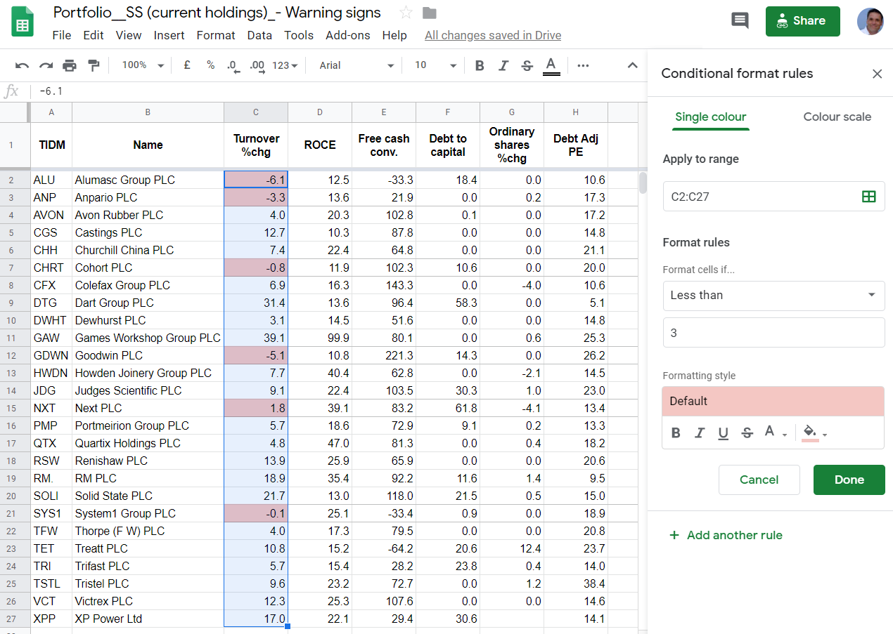
Click Done, and repeat the process for all the other columns. Now, whenever we open this spreadsheet we will be able to see the potential problem shares. Here is the sheet, spruced up a bit for publication:
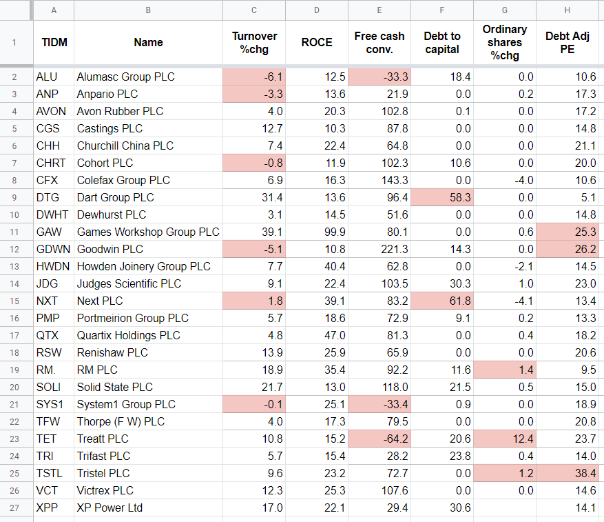
As you can see, there is plenty to worry about, which pretty much sums up my approach to investing!
Different strokes
Though I did not use TTM (Trailing Twelve Month data) because it is not available for ratios calculating growth rates (like turnover growth and share count), choosing TTM for the other ratios like return on capital employed, free cash conversion, and debt to capital, when you add a column would give you a more up to date view of any shares that have recently published half-year or quarterly results.
There are also three statistics in SharePad that aggregate fundamental data to score a company’s financial health. They are the Z-Score, the M-Score, and the F-Score.
(You can add columns for each of the above scores on any list in SharePad by selecting the scores under ‘Financial health’ in the ‘Ratio’ or ‘Rank’ sections, click here to read more about adding columns. You can also create your only filters for these scores – you can learn more about filtering here)
Use these ratios with caution as they do not always mean a share will perform badly. If your investments score badly though, it may be worth investigating why…
Richard Beddard.
Contact Richard Beddard by email: richard@beddard.net or on Twitter: @RichardBeddard.
This article is for educational purposes only. It is not a recommendation to buy or sell shares or other investments. Do your own research before buying or selling any investment or seek professional financial advice.